Table of Contents:
- Use a concise and informative headline.
- Fill your landing page with functional graphics.
- CTA – call to action
- Try to keep the user’s attention
- Show off your references
- Conclusion – 5 Tips for a Better Landing Page
Last updated December 6th, 2023 00:26
I have already written about the difference between a classic website and a landing page, as it is quite significant. If, at a certain stage of website development, advertising, and company presentation, you decide to create a landing page for your ads, it is good to follow certain rules. This can make the landing page more attractive to your potential customers. So let’s take a look at 5 tips for a better landing page. It can help you at least initially to focus on what you can emphasize or avoid.
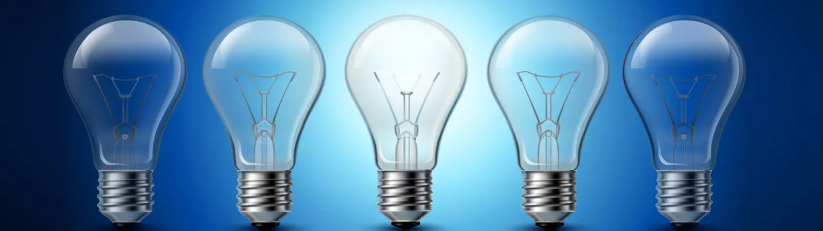
Use a concise and informative headline.

Every landing page starts with a headline. It will be the first thing your customer sees. Usually, the headline will also determine whether they will continue reading or not. With the headline, it is more important than anywhere else not to exaggerate. The more grandiose and longer the headline, the more likely you are to reduce the chance that potential customers will continue to an action button. Overblown headlines simply don’t work anymore.
Most internet users aren’t looking for sensation. They expect a clear and meaningful, concise headline that represents the content of the page. So put in the effort to make the headline short and informative. It should definitely not be longer than 5-9 words. Always assume that thanks to the headline, you only have a few seconds during which you can either grab the customer’s attention or send them elsewhere.
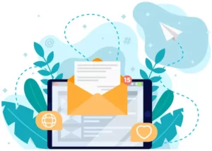
Fill your landing page with functional graphics.
It’s important to include graphics on your landing page that are closely related to the product being sold. If you’re selling a physical product (coffee maker, bicycle, mobile phone…), it’s appropriate to have at least a few basic and well-crafted photographs of the product. On the other hand, if you’re offering a service instead of a product, you can add eye-catching graphics to the page that express how your service is better than the competition.
For example, you will have a page on your website that offers food delivery. So you can use such graphics to show how much faster you are in delivery compared to the competition. Also, you can show that you pack your food in eco-friendly materials. There is always a target group of users who will be interested in such information presented with graphics. This makes it much easier to keep users’ attention until they potentially place an order. For customers, information presented in the form of graphics is much faster than text.
CTA – call to action
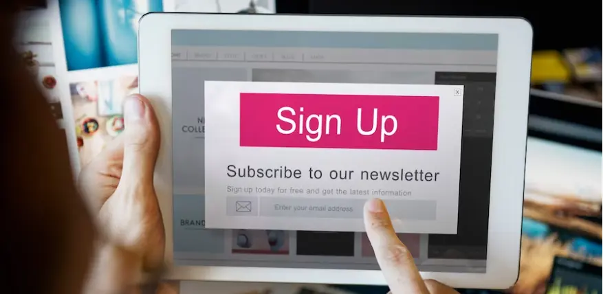
Call to action is essentially the primary purpose of a landing page. It’s about presenting a customer with a call to action that you would like them to take. This call to action can take on different forms. You may simply want them to sign up for a newsletter, place an order for a product, or complete a survey. This brings us to the actual action button, which should be placed on the page multiple times. Especially in case, if the page is longer than normal.
Placing the CTA at the end of the page and hoping that the customer will reach it is the worst option. It simply doesn’t work well. It’s a good idea to incorporate the CTA in multiple places on the landing page so that it is easily accessible and visible from multiple parts of the content.
The CTA must clearly define the action that it performs. The customer should know what will happen the moment they press the button. For example, “order now”, “sign up for our newsletter”, “vote in the poll”…
Try to keep the user’s attention

The user’s attention is the most important thing you have. If they tend to skip text because there is too much of it on the page, it’s likely that they won’t read any of the content and will just leave. Here, more than ever, less is sometimes more.
Don’t try to overwhelm users with a large amount of information at all costs. Focus only on the key features of the product or service and list them for users, even in bullet points if necessary. Provide information with individual, short, and precisely formulated sentences. In today’s fast-paced world, no one will want to spend hours reading a large amount of text on a website before getting to the order. Use reviews on the website for this purpose.
Show off your references
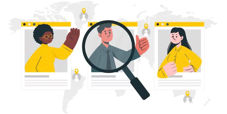
Do you have positive feedback from customers on social media platforms such as Heureka or Zbozi.cz? If your answer is yes, consider adding those references to your landing page. While it is expected that you will write only positive things about your service or product, references from real customers are evaluations from people who have purchased and are satisfied with your product or service. These references bring the experiences of real end-users into the landing page.
In general, if your service satisfies a larger number of people, users of your website will have a greater tendency to buy and trust your product. A few individual references on the landing page can be a great way to promote the product from the perspective of the end-user. However, the rule of “less is more” also applies here. You do not need many references. Use references relatively sparingly, or try using a slider that randomly rotates individual references.
Conclusion – 5 Tips for a Better Landing Page
A landing page can be a great choice that, coupled with good advertising, can potentially increase the conversion rate of users. I hope these few basic tips will help you decide how to structure your landing page. Sometimes, it only takes a little effort to turn a good page into a flop and vice versa. Moreover, for a page that is usually part of a paid advertisement, one must think even more carefully. If you are planning your first landing page as part of a paid advertisement, I wish you much success and many satisfied customers.
The website is created with care for the included information. I strive to provide high-quality and useful content that helps or inspires others. If you are satisfied with my work and would like to support me, you can do so through simple options.
Byl pro Vás tento článek užitečný?
Klikni na počet hvězd pro hlasování.
Průměrné hodnocení. 0 / 5. Počet hlasování: 0
Zatím nehodnoceno! Buďte první
Je mi líto, že pro Vás nebyl článek užitečný.
Jak mohu vylepšit článek?
Řekněte mi, jak jej mohu zlepšit.
Subscribe to the Newsletter
Stay informed! Join our newsletter subscription and be the first to receive the latest information directly to your email inbox. Follow updates, exclusive events, and inspiring content, all delivered straight to your email.
Are you interested in the WordPress content management system? Then you’ll definitely be interested in its security as well. Below, you’ll find a complete WordPress security guide available for free.