
Last updated December 6th, 2023 06:21
Elementor is becoming an increasingly popular website editor built on the WordPress content management system. Elementor, both in its PRO and free version, contains various features that are not, or minimally, visible at first glance. In the following series of tips and tricks for Elementor, I would like to take a closer look at some of them and show them through examples in a series format. Let’s get started for “tips and tricks for Elementor #3”.
Tips and tricks for Elementor #3
1.) Reversed Columns
Since your website will be used by visitors on various devices, it is important to ensure that the website is displayed correctly on all devices. This is generally called website responsiveness. This means that if you view the website using a traditional computer, all elements are usually available in the best resolution. However, a mobile phone does not have such a large display area, so it is necessary to adjust the appearance of the website so that everything essential is clearly visible on its display.
This brings us to the tip of reversed columns. Because what makes perfect sense in display on a computer may not make the same sense on a mobile device. Sometimes it makes more sense on a mobile device when the content of two columns is reversed. In simplified terms, we are talking about this:

Reversed columns in Elementor
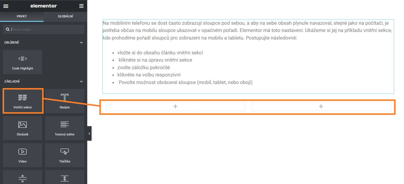
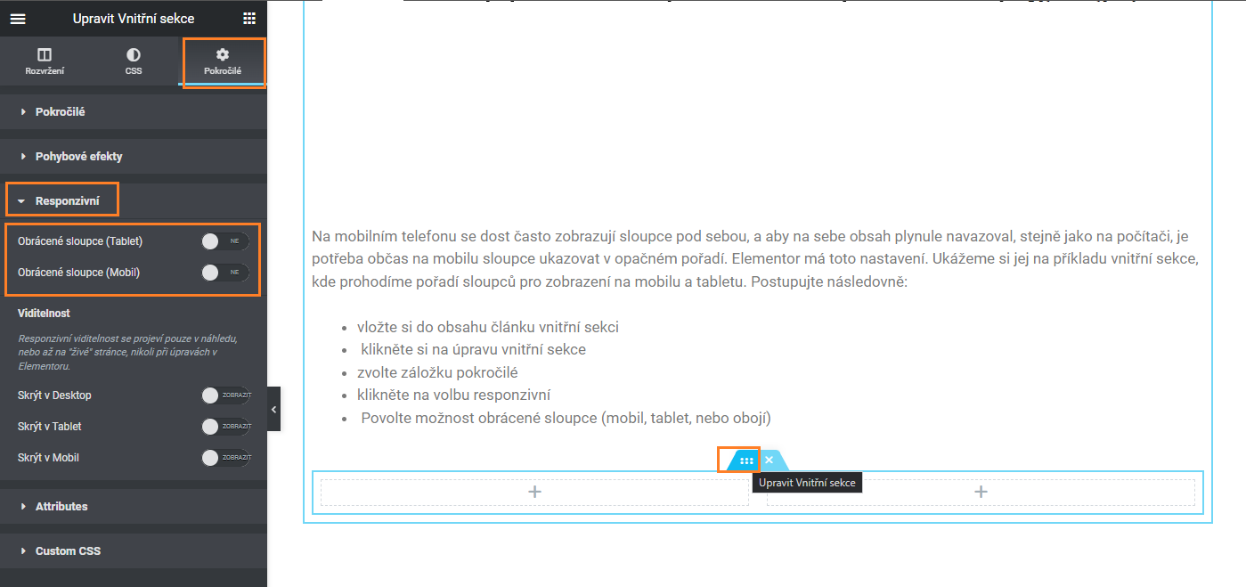
Columns in mobile view are often displayed one below the other and in order for the content to smoothly follow each other, just like on a computer, it is necessary to show the columns in reverse order on mobile (if multiple blocks are displayed one after the other, it makes sense to have them arranged vertically on mobile). Elementor has this setting as a standard option. Let’s take a look at an example of an inner section where we switch the column order for mobile and tablet display. Follow these steps:
- insert an inner section into the article content
- click on edit inner section
- select the advanced tab
- click on the responsive option
- Enable the option for reversed columns (mobile, tablet, or both).
Once this setting is enabled, the columns will be displayed in reverse order on mobile and tablet devices.
So, instead of A-B, it will be B-A
2.) Custom breakpoint – custom points for responsive mode
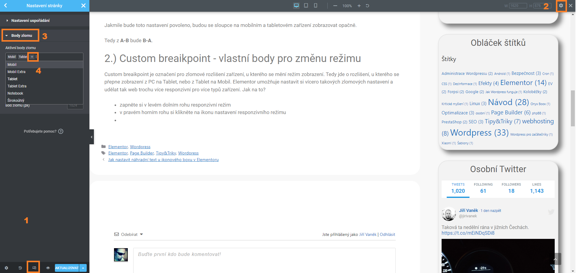
Custom breakpoint refers to the breakpoint resolution of the device where the display mode of the website changes. It means the resolution where the website switches from PC to tablet or from tablet to mobile display. Elementor allows you to set multiple breakpoint resolutions, making the website more responsive for different types of devices. How to do it?
- Enable the responsive mode in the lower left corner
- Click on the responsive mode settings icon in the upper right corner
- Go to the “Breakpoint” tab
- Add the device resolution you want to test through Elementor
The resolution for changing the mode can then be set entirely according to your preferences. Again, in this same setting.

3.) Entrance animations
Elementor allows you to set entrance animations for elements inserted into the content of your article or page (or template). When a visitor scrolls down the page, the elements are displayed to them according to the selected entrance animations. One such animation is included in this block as an example, so it is immediately clear what we are talking about (try refreshing the page to see it again). Specifically, this animation is the sliding up animation for a block. How can you set it up?
- Click on the settings of any element, block, or section…
- Go to the “Advanced” tab.
- Select the “Motion Effects” tab.
- Choose “Entrance Animation” and select the type that suits you.
- Set the speed (slow, normal, fast) and delay before animation (in milliseconds -> 1000 ms = 1 second).

The website is created with care for the included information. I strive to provide high-quality and useful content that helps or inspires others. If you are satisfied with my work and would like to support me, you can do so through simple options.
Byl pro Vás tento článek užitečný?
Klikni na počet hvězd pro hlasování.
Průměrné hodnocení. 0 / 5. Počet hlasování: 0
Zatím nehodnoceno! Buďte první
Je mi líto, že pro Vás nebyl článek užitečný.
Jak mohu vylepšit článek?
Řekněte mi, jak jej mohu zlepšit.

Subscribe to the Newsletter
Stay informed! Join our newsletter subscription and be the first to receive the latest information directly to your email inbox. Follow updates, exclusive events, and inspiring content, all delivered straight to your email.
