
Table of Contents:
Last updated December 6th, 2023 06:19
To ensure that your website functions properly on all devices, it is necessary to ensure the responsiveness of the website. This means that you need to adjust the appearance of the website so that it displays well on the screens of mobile devices, which have a smaller display area than traditional computers. Because what is suitable for display on a computer may not be suitable for mobile devices, and vice versa. It is good to consider the use of reversed columns, which means that the content of two columns can be swapped on a mobile device to make it more user-friendly. Below is a tutorial on how to reverse columns in Elementor on mobile devices or tablets – video.
A column can have different widths, and you can adjust the number of columns in a row as needed. For example, a column with a width of 1/3 will take up one-third of the row's width, while a column with a width of 2/3 will take up two-thirds of the row's width.
By using columns in Elementor, you can create very flexible and adaptable layouts for your webpage. These layouts can then be optimized for various devices, such as mobile phones, tablets, and computers.
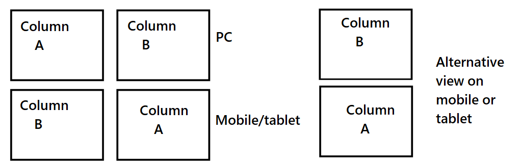
How to reverse columns in Elementor on mobile devices or tablets – video
The website is created with care for the included information. I strive to provide high-quality and useful content that helps or inspires others. If you are satisfied with my work and would like to support me, you can do so through simple options.
Byl pro Vás tento článek užitečný?
Klikni na počet hvězd pro hlasování.
Průměrné hodnocení. 0 / 5. Počet hlasování: 0
Zatím nehodnoceno! Buďte první
Je mi líto, že pro Vás nebyl článek užitečný.
Jak mohu vylepšit článek?
Řekněte mi, jak jej mohu zlepšit.

Subscribe to the Newsletter
Stay informed! Join our newsletter subscription and be the first to receive the latest information directly to your email inbox. Follow updates, exclusive events, and inspiring content, all delivered straight to your email.
Are you interested in the WordPress content management system? Then you’ll definitely be interested in its security as well. Below, you’ll find a complete WordPress security guide available for free.